Home » Blog »
 Harbour Mist
Shades similar to Harbour Mist are becoming a popular choice for almost every room in the home. It’s ideal for those looking to keep the walls, window space and carpets clean-looking, without being boring. You can then jazz up a room by mixing it with metallics, velvets and other textures to compliment it and give it a luxurious feel.
Coconut Milk
In nearly every base colour palette there almost has to be a white shade. But why? Whites are great for brightening up a home and go with practically every other colour out there. Our choice of Coconut Milk gives you a versatile colour that you can experiment with to create a stunning interior, whether you’re looking to go bright and beautiful or play it safe with a slightly calmer colour.
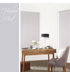
Harbour Mist
Shades similar to Harbour Mist are becoming a popular choice for almost every room in the home. It’s ideal for those looking to keep the walls, window space and carpets clean-looking, without being boring. You can then jazz up a room by mixing it with metallics, velvets and other textures to compliment it and give it a luxurious feel.
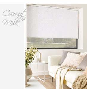
Coconut Milk
In nearly every base colour palette there almost has to be a white shade. But why? Whites are great for brightening up a home and go with practically every other colour out there. Our choice of Coconut Milk gives you a versatile colour that you can experiment with to create a stunning interior, whether you’re looking to go bright and beautiful or play it safe with a slightly calmer colour.
 However, as much as these colours are great when paired with one another, they’re also extremely well suited to other bolder shades. By mixing the base colours with bright colours you can create different moods within your home to build a perfect balance of fun and relaxation.
 1. Emperador 2. Chilli Oil 3. Cherry Tomato 4. Blooming Dahlia 5. Almost Mauve 6. Meadowlark
 Now you know a little more about the spring and summer design trends for 2018, you’ll be able to decorate your home with our stunning, high-quality blinds that interior designers are also choosing.
To find out more about any of the blinds featured in this post, click on the images. Simple. Don’t forget that you can order up to five, free fabric swatches via the website. Alternatively, you can contact us for more information.
Now you know a little more about the spring and summer design trends for 2018, you’ll be able to decorate your home with our stunning, high-quality blinds that interior designers are also choosing.
To find out more about any of the blinds featured in this post, click on the images. Simple. Don’t forget that you can order up to five, free fabric swatches via the website. Alternatively, you can contact us for more information.
Go-To Interior Design Trends for Blinds: Summer 2018
Apr 22 2018
Last spring and summer interior trends called for tropical summer shades and vibrant floral patterns with our blinds. However, this year we’re looking at a slightly more subtle, yet stunning palette. You’ll find four relaxing shades that compliment every room whilst effortlessly matching the bold, vibrant colours too. Read on to see some of the amazing interior design trends of 2018 that we are loving and learn how to incorporate them to your home in a blind.The Base Colours
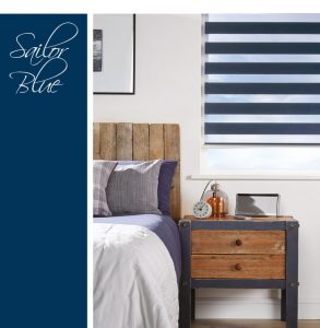
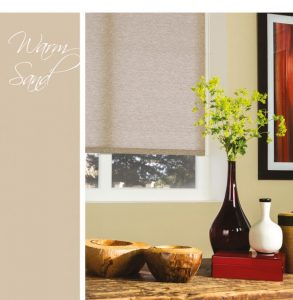
Before we get into the details of selecting your spring blind, let’s take a look at the four base colours we’re seeing a lot of this year. This colour palette consists of a Sailor Blue, Warm Sand, Harbour Mist and Coconut Milk. These colours work extremely well when mixed and matched together. You get a perfect starting point to work from when refreshing the look of a room. Sailor Blue Starting with such a bold colour as Sailor Blue might seem daunting to some, but by balancing with softer colour tones or layering with warmer shades you can create a relaxing bedroom, a stress-free study or bringing a homely feel to a previously cold, uninviting bathroom. Warm Sand While beige shades may have an unwanted reputation for being ‘boring’, a warm off-white such as Warm Sand can act as an ideal base neutral shade for more adventurous colour tones and features that really stand out.
Harbour Mist
Shades similar to Harbour Mist are becoming a popular choice for almost every room in the home. It’s ideal for those looking to keep the walls, window space and carpets clean-looking, without being boring. You can then jazz up a room by mixing it with metallics, velvets and other textures to compliment it and give it a luxurious feel.
Coconut Milk
In nearly every base colour palette there almost has to be a white shade. But why? Whites are great for brightening up a home and go with practically every other colour out there. Our choice of Coconut Milk gives you a versatile colour that you can experiment with to create a stunning interior, whether you’re looking to go bright and beautiful or play it safe with a slightly calmer colour.
However, as much as these colours are great when paired with one another, they’re also extremely well suited to other bolder shades. By mixing the base colours with bright colours you can create different moods within your home to build a perfect balance of fun and relaxation.
Additional Colours
So, if you’re looking to add a little more vibrancy, perhaps to reflect your personality, there are an additional twelve colours in the palette. These are perfect to suit all tastes and styles, consisting of soft, ice-cream pastels, deep cherry reds and beachy blues and greens. When blended with the base colours, they can create a wonderful look that allows you to explore your style and create a room that’s completely unique to you. The fashion colours are very paintbox in style but there are more muted options available depending on your own personal taste. However, if you’d like to enquire about any of the above shades, the colours are as follows:
1. Emperador 2. Chilli Oil 3. Cherry Tomato 4. Blooming Dahlia 5. Almost Mauve 6. Meadowlark
- Lime Punch 8. Arcadia 9. Little Boy Blue 10. Pink Lavender 11. Spring Crocus 12. Ultra Violet
How To Make Them Work
Now you know the colours, it’s important to see them in a “real-life” situation to get a feel for the perfect spring and summer blinds of 2018. Before diving into some of our favourite summer shades, it’s important to know that each of our roller blinds is super easy to clean, antibacterial, flame retardant and energy saving. What more could you want?Adding A Pop Of Colour
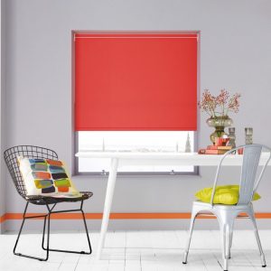
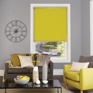
The first example shows a Carnival range of Roller Blinds. If you’re looking to add the latest fashion colours to your house, these blinds will definitely have something to suit. You’ll receive a high-performance fabric in the most beautiful, bold colours out there. From bright corals to lime greens and pacific blues, each shade beautifully suits the 4 base colours to funk up a room without overpowering it. For the Carnival collection, we suggest pairing a Carnival Coral or a Carnival Chartreuse roller blind with the cool-toned Harbour Mist from the base colours.
Keeping It Subtle
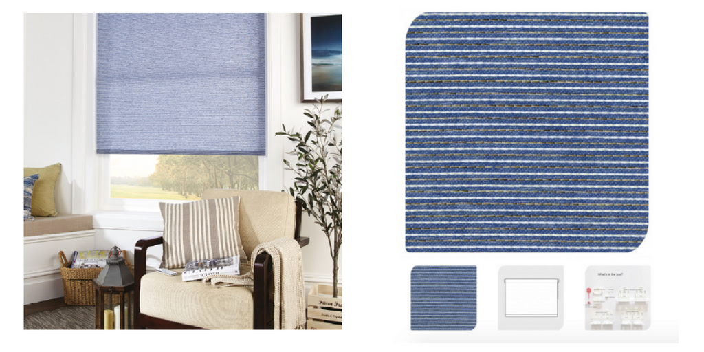
If you’re wanting to keep your room fairly subtle and simple, that doesn’t mean you’re limited to just creams, whites and greys. Your window space can easily be given a little more life with some softer toned shades. In the below example, you can see that this living space focuses on the colour Warm Sand. However, in order to bring it to life, a striped blue blind has been added to contrast the neutral tones. This brings style and depth through the different textures and patterns without being overly dramatic.
Now you know a little more about the spring and summer design trends for 2018, you’ll be able to decorate your home with our stunning, high-quality blinds that interior designers are also choosing.
To find out more about any of the blinds featured in this post, click on the images. Simple. Don’t forget that you can order up to five, free fabric swatches via the website. Alternatively, you can contact us for more information.

Browse our range of blinds
Blog Categories
- Allusion Blinds
- Bathroom Blinds
- Bedroom Blinds
- Blackout Blinds
- Buying Guides
- Childrens Blinds
- Cleaning tips
- Conservatory Blinds
- Energy Saving Blinds
- Faux Wood Blinds
- Interior Trends
- Kitchen Blinds
- Motorised Blinds
- Offers
- Perfect Fit Blinds
- Pleated Blinds
- Roller Blinds
- Roman Blinds
- Senses Mirage Blinds
- Shutters
- Uncategorized
- Velux Blinds
- Venetian Blinds
- Vertical Blinds
- Vision Blinds