Offer ends in
Home » Blog »

How To Use A Colour Wheel To Decorate Your House?
Jun 27 2021
Decorating your house might seem overwhelming if you are not an interior designer. However, choosing the colour palette for each room of the house is an easy process if you follow some of the basics of colour theory. As we all know, some colours contrast well together, some complement each other and some just don’t pair at all. Using a colour wheel to come up with the right colour scheme is a fun and easy process once is done correctly. In today’s post, we will introduce you to the colour theory so you can easily decorate your house with the right colour palettes.
The basics of colour theory
To understand the basics of a colour theory let's first look at the colour wheel. The colours that you see are organised into three groups: primary colours, secondary colours and tertiary colours.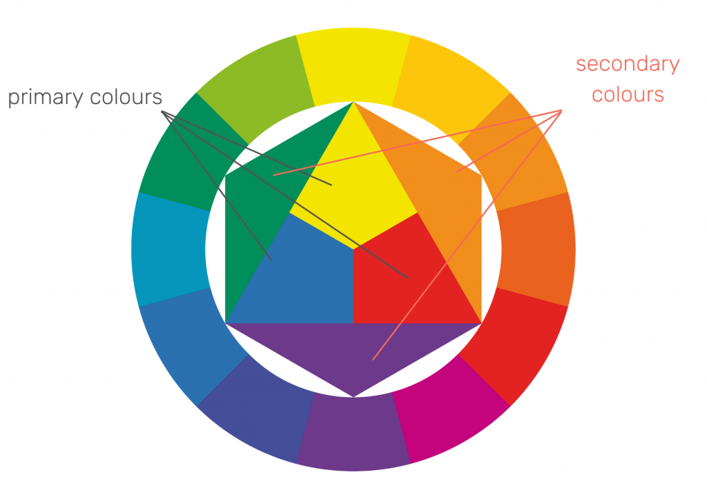
Red, yellow and blue are the base of all the other colours and called primary colours. Secondary colours are orange, green and purple and they are collectively made from a blend of primary colours. Tertiary colours are made from mixing primary colours and secondary colours that are placed near each other on the colour wheel.
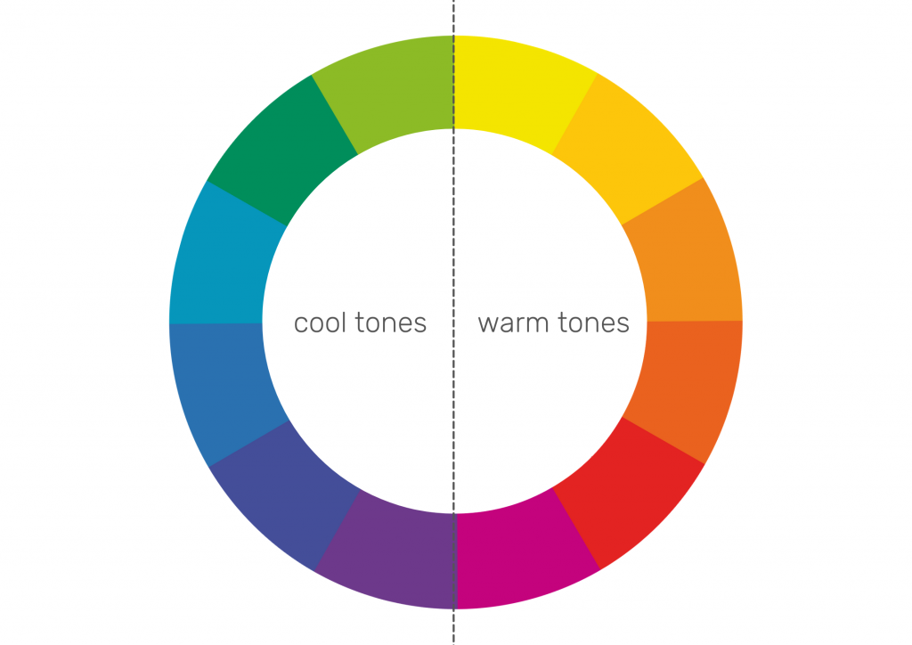
Depending on the purpose of the room you should consider what emotions certain colours evoke. The left side of the colour wheel shows cool colours such as blues, greens, purples. They are generally associated with calm and peace. Cool tones are great for rooms where you want to unwind and relax so they are recommended to be used in bedrooms.
The right side of the colour wheel shows warm tones such as reds, oranges, and yellows that are associated with energy and cosiness. Warm-toned colour palettes will create a cosy and energetic atmosphere so they are great to be used in living rooms.
Neutrals
Neutral tones come from mixing the selected colour with white, black or grey. It allows you to create different hues of one main colour. A tint is created when you add white to a selected colour to lighten it up. To create a shade you need to add black to the base hue and darken the colour. Lastly, a tone is created by adding a grey to slightly darken the shade.
Mixing neutrals with colours is a great way to balance the interior. Neutral shades won't be as overwhelming as vibrant colours and will create a harmonious space. Generally, they are used as a dominant colour in interiors and vibrant colours should be used as secondary colours.
Based on the colour theory, there are four main colour combinations that you can choose to decorate your space.
Monochromatic scheme
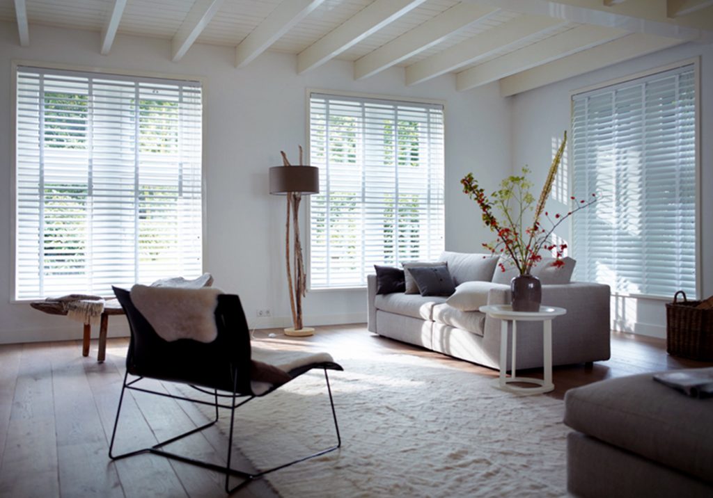
The monochromatic design uses different shades from the same colour on a colour wheel. Monochromatic tones in the interiors are easy to use and create a harmonious look. Mixing light and dark shades can easily create a certain mood in the room depending on which colour you decide to use.
Monochromatic white rooms interiors are popular in Scandinavian style. To decorate a room in a monochromatic colour scheme try to mix different patterns and textures. For example, white faux wood blinds with tapes will add interest to your window while also blending in with the rest of the interior.
Analogous scheme
The analogous colour palette will use three colours that are placed near each other on a colour wheel. These colours will complement each other because they share the same base colour. We would recommend using one of the shades as dominant (for example as the wall colour) and then using the other ones for accents such as soft furnishings or blinds and the third colour for decorations such as cushions and throws.
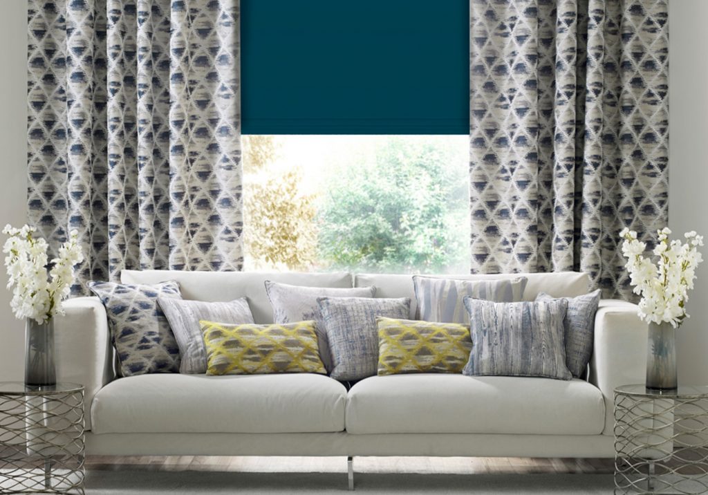
Emerald green, navy blue and mustard yellow create a beautiful analogous colour scheme. A roman blind in a teal colour will become a statement piece if paired with yellow cushions and blue accents.
Complementary scheme
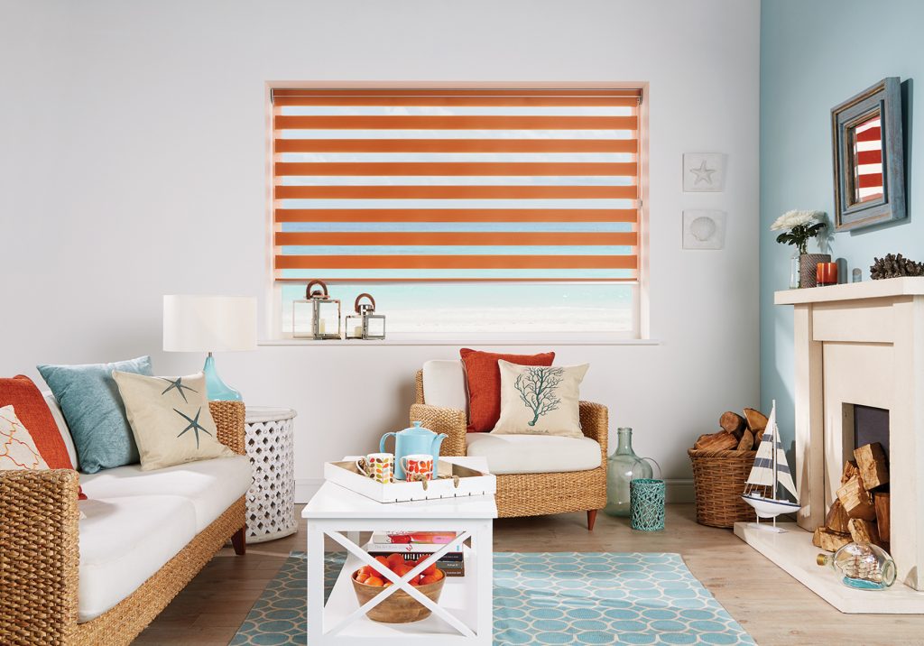
Complementary colours are placed on the opposite sides of the colour wheel. When placed near each other, these colours contrast well and appear brighter. In interior design, it is generally recommended to use one colour as a dominant and then the other as an accent. Some of the great complementary colours combinations are purple and yellow, blue and orange, or green and red.
If you use the right amount of each colour they will balance each other and bring a refreshing feel to your room. For example, you can add a vibrant day and night blind such as our Capri Sunset vision blind to contrast against light blue wall. This colour combination compliments features of the room and makes it feel dynamic and energetic.
We hope that this post will help you decide on which colours to use in decorating. If you need any further advice on what colour of window covering will suit your interior send us a DM on Instagram and we will try to help.
Your Blinds Direct is a leading UK manufacturer of beautiful made-to-measure window blinds, serving customers nationwide. Take a look at our website for a huge selection of blinds styles from roller blinds to roman blinds, materials, and designs.
Content Writer at Your Blinds Direct
